
April 2011
URL: http://www.kingcorn.org/news/timeless/SeedingRates.html
Thoughts on Seeding Rates for Corn
R.L. (Bob) Nielsen
Agronomy Dept., Purdue Univ.
West Lafayette, IN 47907-2054
Email address: rnielsen
at purdue.edu
- Most Indiana corn growers should aim for economic final stands no less than about 30,000 plants per acre.
f all the many agronomic management decisions a corn grower makes each year, one would think that choice of seeding rate would be among the simplest. Yet, this topic continues to garner a lot of attention in coffee shops, Internet chat rooms, the farm press, and in crop seminars. So, apparently this decision is not clear-cut.
I will admit that we agronomists are prone to re-visiting research topics every 10 to 20 years, partly because we wonder whether today's genetics respond differently than yesteryear's hybrids. Nevertheless, I tend to become skeptical when my seed company tells me that I need to increase my seeding rates in order to maximize my corn yield.
Identifying the optimum seeding rate for corn is akin to a balancing act among the various yield components that multiply together to determine grain yield: Plants per acre X Ears per plant X Kernels per ear X Weight per kernel. On the one hand, more plants per acre should equal more ears more acre which should be beneficial for optimizing yield. On the other hand, kernel numbers per plant and weight per kernel eventually decrease with increasing plant populations. That's not good for optimizing yield. Consequently, the optimum final plant population is that which best balances the benefit of more ears per acre with the disadvantage of smaller ears and lighter grain. Furthermore, stalk health and integrity often falter as plant population increases beyond some maximum threshold.
Corn plant populations have been steadily increasing in Indiana for the past 25 years at approximately 300 plants per acre per year (Fig. 1). In 2010, the estimated average plant population statewide was just over 28,000 plants per acre (ppa). Considering an average percent emergence of 95%, this means that the average statewide seeding rate is probably around 30,000 seeds per acre (spa).
Statewide increases in plant population have occurred as growers have shifted from quite low seeding rates to intermediate and higher seeding rates (Fig. 2). In 1997, nearly 60% of Indiana's corn acres reported final stands less than 25,000 ppa and only 8% with final stands greater than 30,000. Whereas in 2010, only 19% of Indiana's acres were reported to be less than 25,000 ppa and nearly 41% of the acres were reported to be greater than 30,000 ppa. Among the changes that have allowed growers to steadily increase plant populations has been the genetic improvement in overall stress tolerance that has resulted in a) ear size and kernel weight becoming less sensitive to the stress of thicker stands of corn and b) improved late-season stalk health.
There are those who contend that an average statewide plant population of 28,350 is too low and that Indiana corn growers are missing out on opportunities for increased grain yields with increased plant populations. Seed companies, in particular, sometimes recommend to their customers that seeding rates should be in the neighborhood of 35,000 or higher to maximize yield and furthermore show yield response data that appear to support those recommendations. Results of some university research also tends to favor these higher seeding rates. Some farmers and consultants point to evidence from high yield corn contests, like that of the National Corn Growers Association, that supports the need for high seeding rates to achieve yields near or above 300 bushels per acre (bpa).
Given the steady, but small, annual rate of increase in seeding rates over the years (300 ppa/year), some growers question whether suddenly increasing their seeding rate by 5000 ppa or more in a single year is a wise decision. What questions should the healthy skeptic ask when presented with advice and recommendations for such high seeding rates?
Yield Response to Seeding Rates: Interpretation of the Data
Ultimately, the answer comes down to what the yield response data tell us. Therein lies the rub, because often we are not privy to the actual yield response data but only to the interpretation of the same. Interpretation of data involves the use of statistical analysis and statistical analysis involves decisions by the researcher on the appropriate mathematical models to rely on to determine optimum seeding rates.
Let's begin with the coffeeshop scuttlebutt that the winners of the NCGA Corn Yield Contest are all using seeding rates of 40,000 or higher in order to achieve those 300+ bpa contest winning entries. While it is true that a fair number of those winners use exceptionally high seeding rates, it is also true that there is not much of a relationship between grain yield and harvest population among those NCGA Contest winners (Fig. 3).
Let's move on to interpretation of yield response data from seeding rate trials. To mathematically describe the yield response to plant population, there are alternative "shapes" or models of response curves to choose from (Fig. 4). From a statistical perspective, more than one model may "fit" or describe the response data well. This presents a challenge to the researcher to then determine which model most accurately describes the yield response data.
If you are still reading at this point, you may well ask "Who cares as long as the model is a good statistical fit?". It matters because the equation that describes the model is subsequently used to calculate or predict the optimum rate. Different equations can lead to different answers and those different answers may result in different economic consequences for the grower who implements the resulting recommendation. An example may help illustrate this quandary.
Figure 5 depicts the yield reponse to a range of six seeding rates. The graph clearly illustrates that grain yield increases with higher seeding rates, but seems to level out beyond about 30,000 ppa.
One could "fit" a straight line (simple linear response curve) model to the data set and fairly accurately describe the yield response to seeding rate (Fig. 6). The "R2" value displayed beneath the line is the statistical value that describes how well the equation for the line "fits" the data set. The closer this value is to "1", the more accurately it describes the data set. For some field research, an "R2" value of 0.61 would be pretty acceptable. If you accepted this linear response model, you would conclude that grain yield would continue to increase as seeding rates increase, i.e., the sky is the limit.
Figure 7 uses a quadratic response curve to describe the data set. The curve itself suggests that yield increases to a maximum, then decreases at seeding rates beyond the maximum. The "R2" value for this response model (0.94) is better than for the linear response model and, frankly, most researchers would be excited to see such a good statistical fit.
Figure 8 illustrates the use of a quadratic-plateau response curve to describe the same data set. The model suggests that yields increase with increasing seeding rates to a point, then levels out at higher seeding rates. The "R2" value for this response model (0.997) implies that the model almost perfectly describes the yield response to seeding rate, although technically the simpler quadratic response curve with an "R2" value of 0.94 is a perfectly acceptable statistical "fit" to the data set.
So, here is the quandary. Two of the possible response models do an excellent job of statistically describing yield response to seeding rate. Statistically, you can't go wrong with either one. However,
- If you accepted the quadratic response model, the optimum seeding rate predicted from the equation would be 39,000 ppa.
- If you accepted the quadratic-plateau response model, the optimum seeding rate predicted from the equation would be 32,000 ppa or 7,000 fewer plants per acre than the optimum rate calculated from the simpler quadratic response model.
Using a fairly common seed cost of $3 per thousand ($240/80k bag), following the recommendation based on the quadratic response model would translate to an additional $21 per acre in seed cost for the grower with no assurance that yields would actually be any higher than if the grower had used the lower seeding rate recommendation based on the quadratic-response model.
Bottom Line
The consequence of this simple example is that researchers bear a responsibility to growers to carefully analyze and interpret yield responses to quantitative crop inputs such as seeding rates or nitrogen fertilizer rates. Based on my interpretation of yield response data from both university and commercial seeding rate trials, I conclude that yield response of today's hybrids to seeding rates can often be described by quadratic-plateau models.
With that premise, I believe that the data suggest that most Indiana corn growers should be targeting final plant populations no less than 30,000 ppa or seeding rates of around 33,000 spa. The primary exception to this interpretation would be those soils or growing conditions that severely limit yield potential (e.g., droughty sandy soils). For those challenging conditions, targeted plant populations should be closer to the mid-20's.
One Last "Fly in the Ointment"
Having gone to all the trouble to discuss differences in yield response models, let me toss out this curve ball to the story. Since 2001, I have conducted 19 field-scale trials throughout the state evaluating corn yield response to seeding rates. These data represent seven individual growing seasons and thirteen different locations around the state. Some of these have been on Purdue's outlying research farms, others have been in collaboration with on-farm cooperators. Harvest plant populations in these trials have mostly ranged from the mid-20's to the low 40's (thousand ppa). The aggregated data for grain yield response to plant population are illustrated in Fig. 9. Across those 19 trials, yield response to plant population has essentially been flat.
Technically, I can "fit" a quadratic-plateau model to the data set that predicts an optimum final stand of 30,203 ppa, but the "R2" value for this response model is only 0.06 which means there is not much of a relationship with the data. In the absence of a statistically significant response curve, my interpretation of the data from those 19 trials is that yields from harvest populations greater than 30,000 ppa were no higher than yields from harvest populations of 30,000 ppa or less.
Opportunities for On-Farm Research
The nearly flat yield response to plant population represented by these 19 trials is the reason I am encouraging folks to consider participating in collaborative seeding rate trials yet this year and beyond to help further define grain yield response to plant population. If rain has kept you from planting yet this season, there is still time to think about an on-farm seeding rate trial. Download the protocol for this at http://www.agry.purdue.edu/ext/ofr/protocols/PurdueCornSeedingRateProtocol.pdf and contact me for additional information.
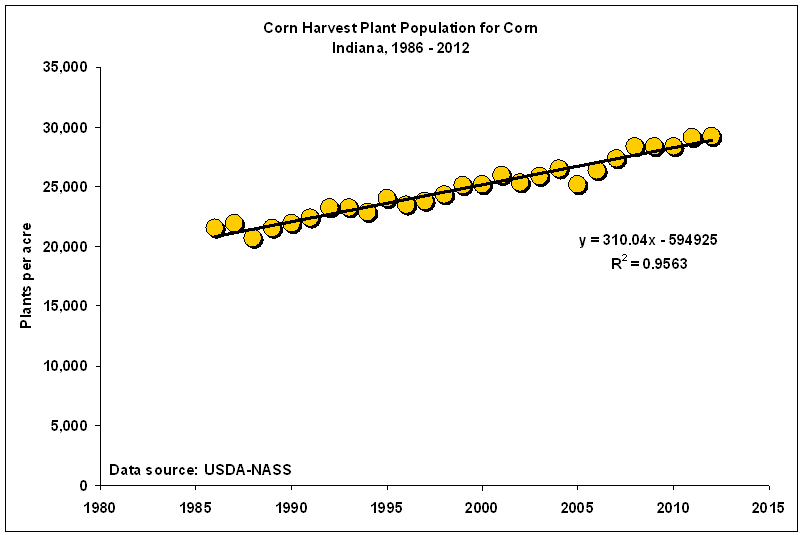
Fig. 1. Changes in reported corn plant populations in Indiana since 1986.
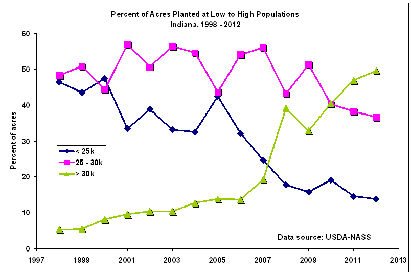
Fig. 2. Percent of Indiana corn acres with plant populations within three ranges of low to high, 1997 - 2010.
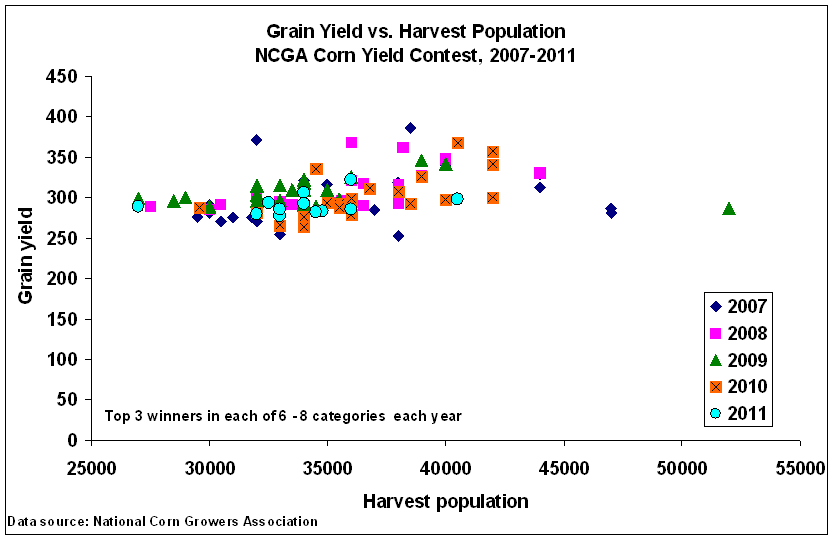
Fig. 3. Grain yield versus harvest population for winners in the NCGA Corn Yield Contest, 2007-2010.
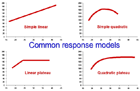
Fig. 4. Alternative mathematical models that can be used to describe the
yield response to quantitative variables
like seeding rate or nitrogen fertilizer rate.
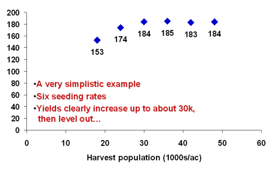
Fig. 5. An example of grain yield response to six seeding rates.
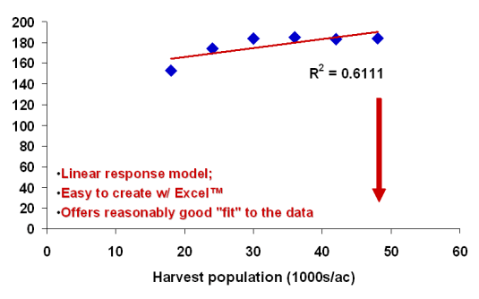
Fig 6. A linear response model "fit" to the same yield response data.
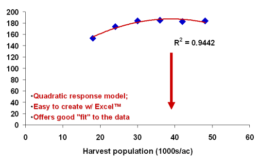
Fig. 7. A quadratic response model "fit" to the same yield response data.
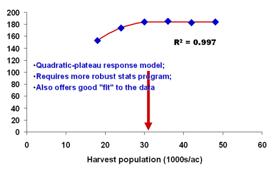
Fig. 8.
A quadratic-plateau response model "fit" to the same yield response data.
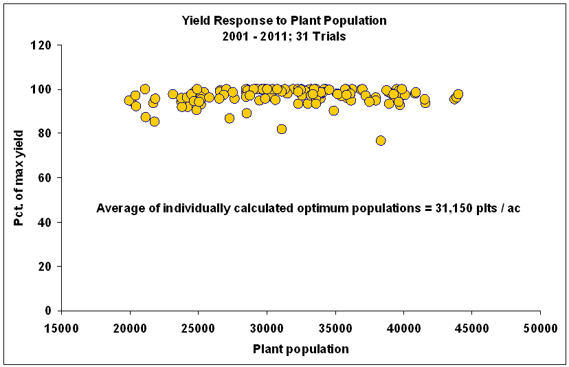
Fig. 9. Corn grain yield response to plant population. Nineteen field-scale trials throughout Indiana since 2001.
